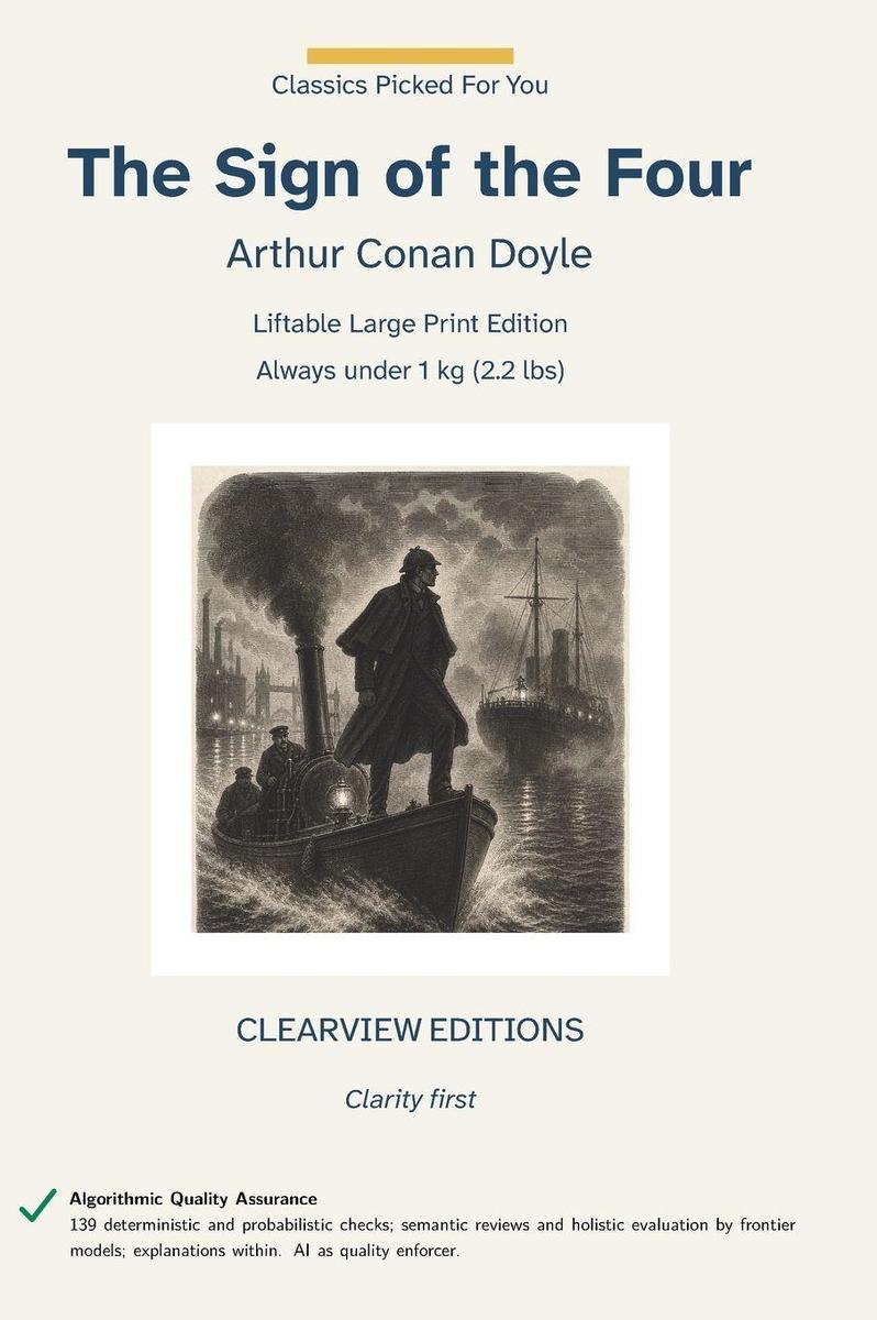
The Sign of the Four by Arthur Conan Doyle, originally published 1890. Commissioned in 1889, the novel first appeared in the February 1890 issue of Lippincott's Monthly Magazine before its publication in book form later that year. Its pursuit of the stolen Agra treasure turns a London mystery into a reckoning with greed, betrayal, and the violent afterlife of empire. The novel helped establish the Holmes investigation as a durable form while introducing Mary Morstan and deepening the partnership between Holmes and Watson.
This is a Liftable Edition: Clearview caps paper-plus-binding weight at 1 kilogram (2.2 pounds) for every Liftable title, so it stays comfortable to hold and read for extended periods -- a physical accessibility standard most large-print publishers do not set at all.
For collection development: this is a large-print edition intended for low-vision and aging patrons, and for any reader who finds standard trade print tiring over a long sitting. It suits large-print and accessibility collections, adult and young-adult general collections where the text is a standard, and reading-room copies where a durable case binding matters. Each volume is held under 1 kilogram (2.2 pounds) of paper and binding, so it can be read at a table or in a lap without a stand. The text is unabridged and reproduced from a public-domain source without modernisation.
Algorithmic Quality Assurance: 139 deterministic and probabilistic checks; semantic reviews and holistic evaluation by frontier models; explanations within. AI as quality enforcer.
This Clearview Editions hardcover is built on a production standard that significantly exceeds the industry norm for large-print publishing. The body text is set at 18-point Atkinson Hyperlegible Next on 27-point leading, 1.5 line spacing --- the minimum WCAG 2.2 Level AAA Success Criterion 1.4.8 sets for a block of text, and the figure UKAAF's large-print guidance gives as well. The leading North American large-print hardcover imprints typically set their body text at 16 point, and most large-print trade paperbacks release at 14 to 16 point. At 18 point, Clearview Editions offers text that is measurably larger than every other major large-print publisher, specifically for readers with low vision, macular degeneration, glaucoma, diabetic retinopathy, or any visual condition that makes standard trade print frustrating or impossible to read for long stretches. The trim size is equally generous. Clearview Editions is printed on a 7x10-inch page, substantially larger than the 6x9 hardcover that is standard in the large-print industry and roughly 50 percent larger by area than the 5x8 trade paperback trim most legacy large-print paperback imprints use.
The extra page area is deliberate: it allows the 18-point body to set at the 50-to-55 character line length that reading-fatigue research identifies as optimal, without the narrow text columns and cramped margins that plague smaller-trim large-print books. The body font, Atkinson Hyperlegible Next, was developed by the Braille Institute of America specifically to maximize letter recognition for readers with low vision, macular degeneration, and visual processing differences. It distinguishes between commonly-confused letter pairs - lowercase l versus uppercase I, the digit 0 versus uppercase O, b versus d, p versus q - using distinctive shape features that preserve readability even under eye strain. Text is set ragged right with no word division: WCAG 2.2 1.4.8 and UKAAF both advise against justifying large-print text, since the uneven word spacing it creates is harder to track, and against breaking a word across a line ending, since the reader then has to reassemble it.
Includes a Lagniappe on Conan Doyle's work as an eye specialist and the art of close observation.